GRAPHIC DESIGNER | VISUAL COMMUNICATOR | ILLUSTRATOR | COLOR GEEK | ANIMATOR | TYPOGRAPHY ENTHUSIAST | CREATIVE TEAMMATE | ADVANCED DOODLER | ARTISTIC GENERALIST | GRAPHIC DESIGNER | VISUAL COMMUNICATOR | ILLUSTRATOR | COLOR GEEK | ANIMATOR | TYPOGRAPHY ENTHUSIAST | CREATIVE TEAMMATE | ADVANCED DOODLER | ARTISTIC GENERALIST |
Avasta
BRAND IDENTITY DESIGN | ART DIRECTION | COLOR STRATEGY
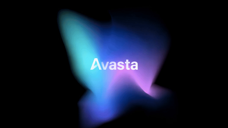
Avasta employs mathematical, data-driven analysis to reveal relevant factors toward building strategies for market success. Their team seeks to understand, reveal, and empower their clients to identify real opportunities that generate, grow, and measure value.
We were asked to develop a visual design system for Avasta driven by simplicity, revelation, and measurement. We simplified both their color palette and typographic systems with intention and candid clarity. The concept of shifting light frequencies and intensity as a visual representation of illumination of new, everchanging information resonated strongly with the client and thus the dynamic gradient motifs were born. Thank you to Executive Producer Kim Catanzaro and CCO Justin Peters for the assists.